I’ve always loved maps for as long as I can remember but knew very little about how professionals make maps or use spatial data with Geographic Information Systems (GIS). As a result, I’ve recently completed the online course Introducing Mapping, Spatial Data and GIS at the Department for Continuing Education, University of Oxford, which was really interesting, and great fun.
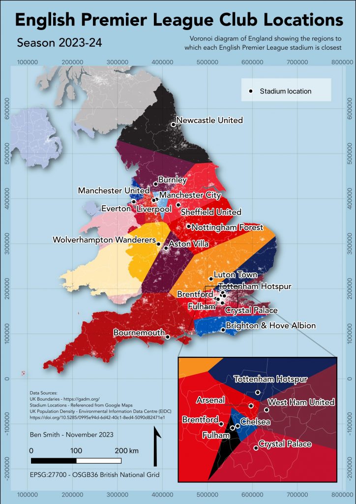
The course used the open-source Quantum GIS software, and at the end of the course, we had to produce a map of our choice using the skills we had learnt. I chose to show the stadium locations of each English Premier League team. I added a Voronoi diagram layer to show the regions which were closest to each of the stadiums. In other words, which team could be considered a location’s ‘local’ English Premier League team.
The result is below. I found out that, by living near Oxford, I should be supporting my local team: Luton Town! It’s a much busier map than I wanted, but I had to include items I wouldn’t have otherwise added such as grid co-ordinates, legend etc, to pass the course. And a few too many teams play in red, so it is not always easy to distinguish between regions, but anyway, these are things to improve on for the 2024-25 season!